Visualizing relationships between variables is crucial in various fields. Scatter plots offer a powerful tool to represent these relationships visually, revealing patterns, trends, and outliers. This guide provides a comprehensive overview of creating scatter plots, from data preparation to interpretation, ensuring clarity and accuracy in your analysis.
Understanding how to create and interpret scatter plots is essential for effective data analysis. This guide will walk you through the entire process, from initial data preparation to advanced techniques, providing practical examples and insights to help you grasp the nuances of this valuable visualization tool.
Introduction to Scatter Plots
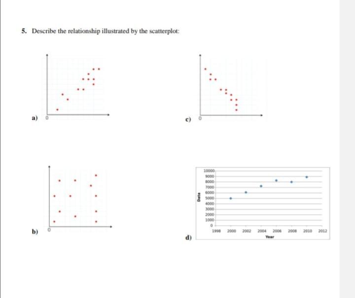
A scatter plot is a graphical representation of data points on a two-dimensional coordinate system. It’s a powerful tool for visualizing the relationship between two variables, allowing us to identify patterns, trends, and correlations. By plotting each data point as a coordinate on the graph, we can easily discern how changes in one variable relate to changes in the other.Scatter plots are particularly useful for detecting the presence and nature of a relationship between variables.
This relationship can be positive, negative, or nonexistent, and the plot’s visual representation makes this identification straightforward. Understanding these relationships is crucial in various fields, from scientific research to business analysis.
Key Components of a Scatter Plot
Scatter plots consist of several key components that contribute to their effectiveness in visualizing relationships. The horizontal axis (x-axis) represents one variable, while the vertical axis (y-axis) represents the other. Each point on the plot corresponds to a specific pair of values from the dataset. The position of each point is determined by the values of the two variables it represents.
Types of Relationships Shown by Scatter Plots
Scatter plots can reveal different types of relationships between variables. The pattern formed by the data points provides valuable insights into the nature of the connection.
- Positive Relationship: In a positive relationship, as the value of one variable increases, the value of the other variable tends to increase as well. The data points generally cluster around an upward-sloping trend line. An example might be the relationship between hours of study and exam scores.
- Negative Relationship: In a negative relationship, as the value of one variable increases, the value of the other variable tends to decrease. The data points generally cluster around a downward-sloping trend line. A classic example is the relationship between temperature and the number of layers of clothing people wear.
- No Relationship: In cases where there is no discernible relationship between the variables, the data points are scattered randomly across the plot, with no clear pattern or trend. For instance, there’s likely no relationship between shoe size and favorite color.
Examples of Relationships
The following table illustrates different types of relationships that can be visualized using scatter plots.
| Variable 1 | Variable 2 | Relationship Type | Description |
|---|---|---|---|
| Hours of Exercise (per week) | Weight (kg) | Negative | As the hours of exercise increase, weight tends to decrease. |
| Age (years) | Height (cm) | Positive | Generally, as age increases, height also tends to increase, although this can vary depending on other factors. |
| Number of Advertisements | Sales Revenue | Positive | More advertisements often correlate with higher sales revenue. |
| Temperature (Celsius) | Ice Cream Sales | Positive | Higher temperatures usually lead to increased ice cream sales. |
| Years of Experience | Salary | Positive | More years of experience typically lead to a higher salary. |
Data Preparation for Scatter Plots
Preparing data for a scatter plot is a crucial step that significantly impacts the visualization’s effectiveness. Thorough data preparation ensures accurate representation of relationships and avoids misleading conclusions. This involves cleaning, transforming, and handling potential issues like missing values and outliers to obtain a dataset suitable for generating meaningful scatter plots. Appropriate variable selection is also vital for drawing valid conclusions.Data preparation involves a series of steps to ensure the quality and reliability of the data used to create a scatter plot.
This includes handling missing values, outliers, and selecting relevant variables. Careful consideration of these aspects helps in creating an accurate and insightful scatter plot.
Data Cleaning and Transformation
Data cleaning is essential for ensuring the accuracy and reliability of the scatter plot. It involves identifying and correcting errors or inconsistencies in the data. Data transformation, on the other hand, modifies the data to make it suitable for analysis. This may include converting data types, applying mathematical functions, or normalizing values.
- Data Cleaning: Common cleaning tasks include identifying and handling erroneous values, correcting typos, and removing inconsistencies in data entry. This process helps eliminate inaccuracies that could distort the relationship depicted in the scatter plot. For instance, a dataset on housing prices might contain incorrect units (e.g., square feet instead of square meters). Cleaning involves correcting these errors to avoid misinterpretations in the scatter plot.
- Data Transformation: Data transformation can involve converting data types (e.g., converting categorical variables to numerical representations). For example, transforming categorical data into numerical data using techniques like one-hot encoding can be necessary for certain analyses and plotting methods. Applying mathematical functions like logarithms or square roots can also be helpful in visualizing relationships between variables more effectively. For example, if the relationship between variables shows an exponential trend, applying a logarithm transformation can linearize the relationship and make it easier to interpret.
Handling Missing Values and Outliers
Missing values and outliers can significantly impact the accuracy of a scatter plot. Strategies for dealing with missing data and outliers are critical for maintaining the integrity of the visualization.
- Missing Values: Missing values can be handled in several ways, including imputation (replacing missing values with estimated values) or removal (deleting rows with missing values). The best approach depends on the specific dataset and the nature of the missing data. For example, if a small percentage of data points are missing, deletion might be acceptable; however, if a substantial amount of data is missing, imputation might be a better option.
The choice depends on the dataset and the characteristics of the missing data.
- Outliers: Outliers are data points that deviate significantly from the rest of the data. These values can distort the relationship between variables in the scatter plot. Outliers can be identified using statistical methods and then handled by removing them or transforming them. For example, if an outlier in housing prices is identified, it could be investigated to determine whether it’s an error or a legitimate data point.
The appropriate action depends on the reason for the outlier.
Selecting Appropriate Variables
Selecting the right variables is crucial for creating a meaningful scatter plot. The choice of variables should reflect the specific relationship being investigated.
- Variable Selection: The variables chosen for the scatter plot should be relevant to the research question or hypothesis. For example, if investigating the relationship between income and education level, income and years of education would be appropriate variables. Careful consideration of the variables’ relevance is important to avoid misleading interpretations. The selection should be guided by the research question and the nature of the data.
Examples of Suitable Data
Scatter plots are suitable for visualizing relationships between two quantitative variables.
- Suitable Data Examples: Examples include visualizing the relationship between house size and price, or the relationship between advertising spending and sales. These examples illustrate how scatter plots can effectively depict correlations or trends between variables. The choice of variables should be relevant to the research question.
Data Cleaning Steps and Plot Impact
The table below illustrates how different data cleaning steps can affect a scatter plot.
| Data Cleaning Step | Description | Impact on Scatter Plot |
|---|---|---|
| Removing outliers | Identifying and removing data points significantly deviating from the rest. | Reduces distortion of the overall trend, improving the visualization of the central relationship. |
| Imputing missing values | Replacing missing values with estimated values. | Maintains the size of the dataset, potentially impacting the accuracy of the plot, depending on the imputation method. |
| Converting units | Ensuring consistent units for variables. | Correctly represents the relationship between variables. |
Creating a Scatter Plot
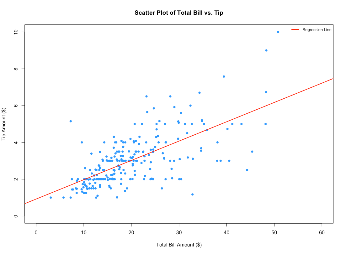
Creating a scatter plot is a valuable visual tool for exploring relationships between two continuous variables. It effectively displays the distribution of data points and helps identify patterns, trends, and potential correlations. This method is crucial for data analysis in various fields, ranging from scientific research to business forecasting.The process of constructing a scatter plot involves plotting individual data points on a two-dimensional coordinate system, where each point represents a specific observation.
The resulting visualization allows for a quick assessment of the nature of the relationship between the variables. This approach provides an intuitive understanding of how changes in one variable might correlate with changes in another.
Creating Scatter Plots with Spreadsheet Software
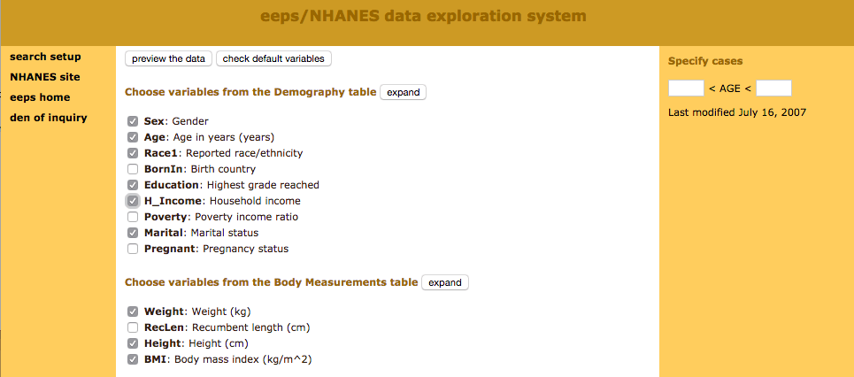
Spreadsheet software like Microsoft Excel or Google Sheets offers user-friendly tools for creating scatter plots. These programs often provide pre-built charts that streamline the process. To create a scatter plot, users typically input their data into columns, select the data, and choose the “scatter” chart type from the chart options. Customization options, such as adding titles, axis labels, and trendlines, are readily available within the software.
Creating Scatter Plots with Statistical Software
Statistical software packages, such as R or SPSS, provide more advanced functionalities for creating and analyzing scatter plots. These tools offer greater control over plot customization and allow for complex statistical analyses to be performed on the data displayed in the plot. They can generate sophisticated plots, including those with various markers, colors, and data transformations.
Types of Scatter Plots
Different types of scatter plots cater to various needs and data characteristics. Simple scatter plots are commonly used to visualize relationships between two continuous variables. Bubble charts, a variation of scatter plots, use the size of the plotted data points to represent a third variable, allowing for the visualization of three-variable relationships. Matrix scatter plots display the relationships among multiple variables simultaneously, offering a comprehensive overview of the dataset’s structure.
Scatter Plot Examples and Customizations
A scatter plot of house prices versus square footage, for instance, could reveal a positive correlation, meaning higher square footage tends to correlate with higher prices. The plot could be further customized by adding a trendline to visually represent the relationship’s direction. Color-coding the data points based on another variable, such as the neighborhood, can also enhance understanding.
Customizing the Scatter Plot
Adding titles, axis labels, and legends to a scatter plot is crucial for clarity. A clear title provides context, while informative axis labels explain the variables being plotted. A legend, when necessary, helps distinguish different data categories, providing a complete and easily understandable representation. Trendlines, often linear or non-linear, help to visually represent the overall trend within the dataset.
Using appropriate visual elements, such as varying point shapes or colors, enhances data interpretation and provides greater insights.
Comparison of Plotting Tools
| Feature | Spreadsheet Software (Excel, Google Sheets) | Statistical Software (R, SPSS) |
|---|---|---|
| Ease of Use | High | Medium to High |
| Customization Options | Limited | Extensive |
| Statistical Analysis | Basic | Advanced |
| Data Handling Capacity | Moderate | High |
| Plot Types | Limited to basic scatter plots and bubble charts | Variety of plot types, including matrix plots and specialized charts |
Spreadsheet software is suitable for basic scatter plots, while statistical software provides advanced capabilities for comprehensive analysis and customization. Spreadsheet software provides a quick and easy way to visualize data, while statistical software offers more sophisticated analysis options.
Interpreting Scatter Plots
Interpreting a scatter plot involves analyzing the pattern of data points to understand the relationship between two variables. This analysis allows for the identification of trends, outliers, and the overall strength of the correlation between the variables. Understanding these relationships is crucial in various fields, from scientific research to business forecasting.
Identifying Relationships
Scatter plots visually represent the relationship between two variables. By observing the distribution of data points, we can determine the type and strength of the relationship. A positive relationship indicates that as one variable increases, the other tends to increase as well. Conversely, a negative relationship suggests that as one variable increases, the other tends to decrease.
Identifying Patterns and Trends
The arrangement of data points on a scatter plot reveals patterns and trends. A linear trend indicates a consistent increase or decrease in one variable relative to the other. A non-linear trend suggests a more complex relationship, such as a curve or a cyclical pattern. Recognizing these patterns is fundamental to understanding the underlying relationship.
Recognizing Outliers
Outliers are data points that deviate significantly from the general trend of the scatter plot. These points may represent errors in data collection, unusual events, or simply data points that do not fit the general pattern. Identifying and understanding outliers is important for accurate interpretation and may indicate the need for further investigation. Identifying these outliers can help determine if the data points are accurate or if they represent an error in measurement or recording.
Using Trendlines
Trendlines are lines drawn on a scatter plot to visually represent the general trend of the data. These lines can be used to estimate relationships between variables and make predictions. For example, a linear trendline can be used to predict the value of one variable given a value of the other. A trendline can also help to highlight potential relationships and to estimate future values.
Examples of Different Correlations
Different scatter plots illustrate various types of correlations. A strong positive correlation shows a clear upward trend, where data points cluster closely around a line sloping upward. A strong negative correlation demonstrates a clear downward trend with data points clustering closely around a line sloping downward. Weak positive and weak negative correlations indicate a less pronounced trend, with data points scattered more widely.
A scatter plot with no correlation shows a random distribution of data points, suggesting no discernible relationship between the variables.
| Correlation Type | Description | Scatter Plot Appearance | Implications |
|---|---|---|---|
| Strong Positive | Variables move in the same direction. | Points clustered closely around a line sloping upward. | High degree of dependence. |
| Strong Negative | Variables move in opposite directions. | Points clustered closely around a line sloping downward. | High degree of inverse dependence. |
| Weak Positive | Variables tend to move in the same direction but with less certainty. | Points scattered around a line sloping upward. | Moderate degree of dependence. |
| Weak Negative | Variables tend to move in opposite directions but with less certainty. | Points scattered around a line sloping downward. | Moderate degree of inverse dependence. |
| No Correlation | Variables do not show any clear relationship. | Points scattered randomly. | No dependence between variables. |
Advanced Techniques and Considerations
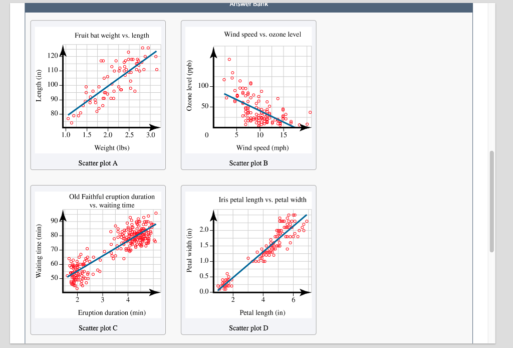
Scatter plots are powerful tools for visualizing relationships between variables. Beyond basic bivariate plots, advanced techniques allow for the exploration of more complex relationships and the effective presentation of substantial datasets. This section will delve into strategies for handling multiple variables, enhancing clarity through symbolic representations, understanding correlation, managing large datasets, and the crucial role of axis scaling in accurate interpretation.
Multiple Variables in Scatter Plots
Scatter plots are not limited to displaying the relationship between two variables. They can effectively depict the relationship between three or more variables by using different plotting symbols or colors to represent distinct categories or groups within the data. For instance, a scatter plot could display the relationship between house prices, size, and location by assigning different colors to houses in different neighborhoods.
This allows for a layered understanding of the interplay between multiple factors.
Plotting Symbols and Colors for Clarity
Using a variety of plotting symbols and colors can significantly improve the clarity and interpretability of scatter plots, especially when dealing with multiple variables. Different symbols can represent different categories or groups, while colors can provide further distinctions. This approach is crucial for quickly identifying patterns and trends associated with specific subgroups. For instance, a scatter plot showing the relationship between student grades and hours of study could use different colors to represent students from different academic programs.
This would allow for a comparison of study habits across various programs.
Correlation and Scatter Plots
Correlation quantifies the strength and direction of the linear relationship between two variables. A scatter plot visually represents this relationship. The strength of the correlation is reflected in the closeness of the points to a linear trend. A strong positive correlation will show points clustered closely around an upward-sloping line, while a strong negative correlation will show points clustered around a downward-sloping line.
A weak correlation will display points scattered without a clear linear trend.
Handling Large Datasets
Scatter plots can handle large datasets, but effective visualization requires strategic approaches. Subsetting the data can create separate plots for specific subsets or groups, simplifying the visualization of relationships within smaller segments. Additionally, using techniques like binning or aggregation can help condense the data while preserving meaningful trends. For instance, instead of plotting each individual sale transaction, a scatter plot of average sales per week over a year would be a more effective presentation of sales trends.
Importance of Axis Scaling
The scale of the axes in a scatter plot is critical for accurate interpretation. Incorrect scaling can distort the relationship between variables, leading to misleading conclusions. For example, if one axis has a much larger range than the other, the plot may emphasize minor fluctuations while obscuring significant trends. Carefully selecting axis scales ensures an accurate and unbiased representation of the data.
Plotting Symbols and Meanings
| Symbol | Meaning |
|---|---|
| Circle (●) | General data point |
| Square (□) | Category A |
| Triangle (▲) | Category B |
| Cross (+) | Outliers |
| Star (*) | Special cases |
Examples and Case Studies
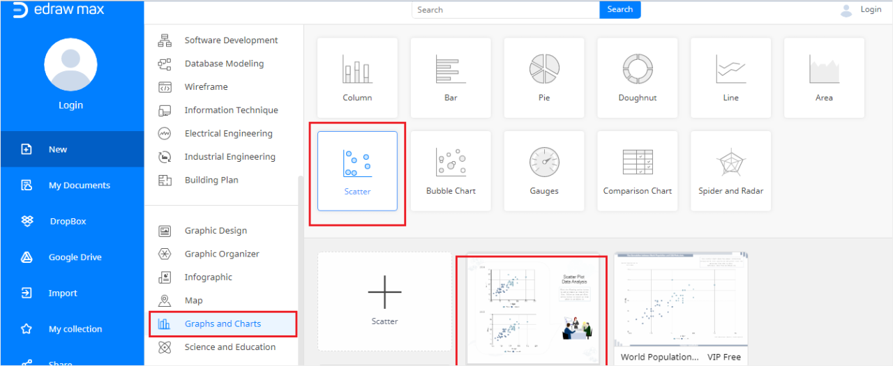
Scatter plots are powerful tools for visualizing relationships between variables. By plotting data points on a graph, patterns and trends become readily apparent. This section will delve into real-world applications of scatter plots, illustrating how they can be used to identify relationships, support hypotheses, and reveal insights in various fields. Understanding these examples will enhance your ability to interpret scatter plots and effectively communicate findings.
Real-World Applications in Business
Businesses frequently utilize scatter plots to analyze sales data, customer demographics, and marketing campaigns. For example, a company might use a scatter plot to examine the relationship between advertising expenditure and sales revenue. This visual representation can reveal whether increased advertising correlates with higher sales, and if so, the strength of that relationship. Another potential use is to investigate the connection between customer age and spending habits.
The plot could display data points representing various customer ages against their average monthly expenditures. Analyzing the pattern can offer insights into whether certain age groups exhibit higher spending tendencies.
Real-World Applications in Science
Scatter plots are invaluable in scientific research. In biology, a scatter plot can be used to determine the relationship between the height and weight of a plant species. The scatter plot would showcase the height of the plant on the x-axis and its weight on the y-axis. Analysis of the plot might reveal a positive correlation, indicating taller plants tend to have higher weights.
In physics, scatter plots are used to represent data from experiments. For example, plotting the force applied to an object against its acceleration can reveal the relationship between the two variables. Understanding the nature of this relationship might lead to a better understanding of the underlying physical principles.
Real-World Applications in Social Sciences
Scatter plots are valuable in social science research. For example, a sociologist might use a scatter plot to analyze the relationship between education levels and income. Plotting the years of education on the x-axis and the corresponding income on the y-axis, one could visualize how education level correlates with income. Another example is a study examining the relationship between social media usage and mental health.
Plotting social media usage time against indicators of mental health (e.g., anxiety levels) could highlight any potential correlations.
Types of Relationships Revealed by Scatter Plots
Scatter plots can reveal a variety of relationships between variables. A positive relationship is evident when higher values of one variable correspond with higher values of the other variable, depicted by an upward trend in the scatter plot. A negative relationship occurs when higher values of one variable correspond with lower values of the other variable, shown by a downward trend in the scatter plot.
A zero or no relationship is present when there’s no apparent trend or correlation between the variables. The strength of the relationship is also visible, with stronger relationships yielding tighter clusters of data points along a trend line.
Supporting or Refuting Hypotheses with Scatter Plots
Scatter plots can be used to test hypotheses. For instance, a researcher might hypothesize that increased exercise leads to lower blood pressure. A scatter plot could visualize the relationship between exercise time and blood pressure levels. If the plot shows a negative correlation, it supports the hypothesis. Conversely, if no discernible pattern exists, the hypothesis might be refuted.
This example demonstrates how scatter plots can be a valuable tool for supporting or challenging research hypotheses.
Summary Table of Real-World Applications
| Field | Variables | Potential Relationship | Example |
|---|---|---|---|
| Business | Advertising Expenditure, Sales Revenue | Positive | Higher ad spending linked to increased sales. |
| Science (Biology) | Plant Height, Plant Weight | Positive | Taller plants tend to weigh more. |
| Social Sciences | Education Level, Income | Positive | Higher education levels are associated with higher incomes. |
Tools and Software
Choosing the right software for creating and analyzing scatter plots is crucial for effective data visualization and interpretation. Different tools offer varying levels of functionality, ease of use, and cost. Understanding the strengths and weaknesses of each tool allows you to select the best fit for your specific needs and data analysis goals.
Popular Software and Tools
Various software and online platforms are available for generating scatter plots. These tools range from dedicated statistical software to spreadsheet programs and interactive web applications. Selecting the appropriate tool depends on the complexity of your data, the desired level of customization, and your budget.
- Microsoft Excel: A widely used spreadsheet program, Excel offers basic scatter plot functionality. It’s user-friendly and readily accessible for simple scatter plots. However, its customization options are limited compared to specialized statistical software. Excel is suitable for smaller datasets and straightforward visualizations. Resources for learning more about Excel’s charting features are readily available through Microsoft’s support website and numerous online tutorials.
- Google Sheets: Similar to Excel, Google Sheets provides a free and accessible platform for creating scatter plots. Its ease of use and collaborative features make it ideal for sharing and working on data visualizations with others. The availability of extensive online tutorials and support communities makes learning straightforward. Google Sheets offers comparable functionality to Excel, but lacks the depth of advanced statistical analysis features.
- R: A powerful open-source statistical programming language, R is a versatile tool for creating highly customized and complex scatter plots. Its flexibility allows for advanced statistical modeling and data manipulation. R’s extensive libraries provide a wide range of plotting options, allowing for detailed customization. Learning R can take time, as it requires some programming knowledge, but numerous online courses and communities can aid in the learning process.
- Python (with libraries like Matplotlib and Seaborn): Python is another popular programming language with strong data visualization capabilities. Libraries like Matplotlib and Seaborn provide robust tools for creating and customizing scatter plots. Python offers a lot of control and flexibility for creating interactive and complex visualizations. Learning Python and its libraries requires some programming knowledge, but many online resources and tutorials facilitate the learning process.
- Tableau: A powerful data visualization tool, Tableau provides an intuitive interface for creating interactive scatter plots. It allows users to quickly explore and analyze data relationships. Tableau’s drag-and-drop interface makes it easy to create visualizations, but it’s typically a more expensive option compared to free or open-source alternatives. Online tutorials and documentation are available to assist in learning Tableau’s capabilities.
Comparison of Tools
The table below compares the discussed tools based on features, ease of use, and cost.
| Tool | Features | Ease of Use | Cost |
|---|---|---|---|
| Microsoft Excel | Basic scatter plot creation, limited customization | High | Paid (included with Microsoft 365) |
| Google Sheets | Basic scatter plot creation, collaborative features | High | Free |
| R | Highly customizable, advanced statistical modeling | Medium | Free (open-source) |
| Python (with libraries) | Highly customizable, interactive visualizations | Medium | Free (open-source) |
| Tableau | Interactive visualizations, advanced analytics | Medium-High | Paid (subscription-based) |
Last Recap
In conclusion, this guide has explored the creation and interpretation of scatter plots, demonstrating their versatility in various fields. From basic concepts to advanced techniques, the process is presented in a step-by-step manner, allowing you to confidently build and interpret scatter plots. Remember that careful data preparation, insightful interpretation, and the appropriate use of tools are critical to extracting meaningful insights from your data.