Combination charts, which effectively display multiple data series on a single visual, are invaluable tools for data analysis. This guide provides a structured approach to creating insightful combination charts, covering everything from choosing the right chart type to customizing the final product for maximum impact. Understanding the nuances of data representation and interpretation is crucial for extracting meaningful insights.
This comprehensive resource explores the fundamental principles of combination charts, offering practical steps and examples to help you confidently craft compelling visualizations. From selecting the ideal chart type to tailoring its presentation, the guide empowers you to transform raw data into actionable knowledge.
Introduction to Combination Charts

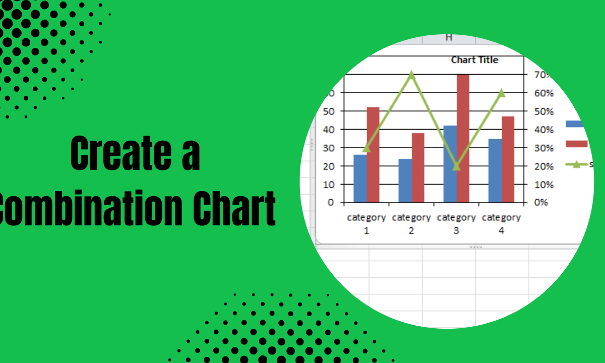
Combination charts are graphical representations that combine different chart types on a single visual. Their primary purpose is to present multiple data series or metrics simultaneously, allowing for a more comprehensive understanding of trends, relationships, and comparisons. They are particularly useful when exploring correlations or contrasting patterns between distinct data sets.Using a single combination chart is often more efficient than creating and analyzing multiple individual charts.
This consolidation simplifies the comparison process, reduces cognitive load, and facilitates a quicker identification of key insights and patterns. The ability to visualize multiple aspects of a dataset in a single view makes combination charts an invaluable tool in data analysis and presentation.
Types of Combination Charts
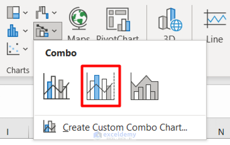
Combination charts offer various configurations, each tailored to present different kinds of data effectively. Common combinations include line and bar charts, line and column charts, and area and bar charts. The choice of chart type depends on the specific data being visualized and the insights you aim to extract. For example, a line chart effectively displays trends over time, while a bar chart highlights comparisons between categories.
A combination chart seamlessly integrates these strengths.
Scenarios for Combination Charts
The suitability of a combination chart depends on the context and the intended message. The following table illustrates various scenarios where a combination chart is a beneficial visualization tool.
| Scenario | Chart Type | Description |
|---|---|---|
| Comparing sales performance across different regions and time periods. | Line and bar chart | A line chart can track sales trends over time for each region, while bar charts can visually compare the sales figures for each region in a specific time period. |
| Displaying website traffic and conversion rates. | Line and column chart | A line chart can show the overall traffic trend over time, while column charts can present conversion rates for different marketing campaigns or time periods. |
| Visualizing website traffic sources and user engagement. | Area and column chart | An area chart can show the cumulative traffic from different sources over time, and column charts can show the traffic volume from each source. |
| Illustrating project progress against budget and schedule. | Line and bar chart | A line chart can display project milestones against the timeline, while bar charts can visualize the budget allocated to each phase of the project. |
| Demonstrating customer satisfaction scores and feedback trends. | Line and column chart | A line chart can show the overall customer satisfaction score trend over time, while column charts can compare satisfaction scores across different product categories or customer segments. |
Choosing the Right Chart Type

Selecting the appropriate combination chart type is crucial for effectively conveying insights from your data. A well-chosen chart type enhances clarity, making complex relationships easily understandable. The best choice depends on the nature of your data and the specific message you want to communicate. Carefully considering the strengths and weaknesses of different chart types ensures accurate and compelling visualizations.
Factors to Consider
Several factors influence the selection of the optimal combination chart. Understanding the data’s characteristics, the intended audience, and the key message to be conveyed are essential considerations. The nature of the relationships between the variables within the dataset and the overall goal of the visualization also play a critical role. Furthermore, the availability of readily accessible tools and software for creating and customizing the charts should be considered to ensure feasibility.
Comparison of Chart Types
Different combination chart types offer unique strengths and weaknesses. Line charts are ideal for depicting trends over time, while bar charts effectively display comparisons across categories. Scatter plots excel at visualizing relationships between two numerical variables. Combining these chart types within a single visualization allows for a more comprehensive understanding of the data. For instance, a combination chart combining a line chart for a trend and a bar chart for category comparisons can reveal trends in sales alongside variations across different product categories.
Categorization of Data Types
The table below provides a general guideline for selecting combination chart types based on data type. The selection process should be tailored to specific data characteristics. Consider the relationship between variables, the data distribution, and the overall message to be communicated.
| Data Type | Suitable Chart Type | Reasoning |
|---|---|---|
| Time Series | Line chart combined with a bar chart or column chart | Line charts effectively display trends over time, while bar/column charts can be used to highlight specific data points or categories at various time intervals. |
| Categorical | Bar chart combined with a line chart or a pie chart | Bar charts are suitable for comparing different categories, while a line chart can show trends across categories. A pie chart can illustrate the proportion of each category. |
| Numerical | Scatter plot combined with a line chart or a box plot | Scatter plots can highlight relationships between numerical variables. Line charts can depict trends in numerical data over time, while box plots can show the distribution of numerical data. |
| Mixed (Numerical and Categorical) | Bar chart combined with a line chart, or a column chart combined with a line chart | This type allows for comparison of categories while simultaneously highlighting trends in the numerical data associated with those categories. |
Creating the Combination Chart

A combination chart effectively displays multiple data series, offering a comprehensive view of trends and comparisons. This versatile visualization combines different chart types, such as lines and bars, on a single graph, allowing for a detailed analysis of various metrics simultaneously. This approach enhances clarity and understanding by showcasing different aspects of a dataset in a single, easily digestible format.
Data Arrangement for Combination Charts
Proper data arrangement is crucial for creating an effective combination chart. Data should be organized in a tabular format, with each row representing a data point and each column corresponding to a specific category or variable. Columns should be clearly labeled to avoid ambiguity. For example, a combination chart comparing sales figures and customer demographics would require columns for sales amounts, customer segment, and possibly region or time period.
A well-structured table ensures accurate representation and interpretation of the data within the chart.
Axes in Combination Charts
The axes in a combination chart play a vital role in defining the scale and relationships between the different data series. The vertical axis, typically the y-axis, is responsible for the numerical values of the data, and the horizontal axis, or x-axis, represents the categories or variables. Careful consideration of the scale on each axis is essential to ensure that the data is displayed accurately and proportionally.
Choosing an appropriate scale prevents distortion of the data and allows for meaningful comparisons.
Labeling and Formatting Chart Elements
Clear and concise labeling of chart elements is paramount for effective communication. Axis labels, data labels (if applicable), and a descriptive chart title are essential for understanding the information presented. Consistent formatting, including font styles, colors, and line styles, further enhances readability and professionalism. Employing appropriate color schemes and legends allows viewers to easily differentiate between data series and understand the meaning behind the visual representation.
Creating a Line and Bar Combination Chart
This section provides a step-by-step guide for creating a line and bar combination chart. This tabular format Artikels the procedure for a line chart representing trends over time, combined with bar charts for specific values at each time point.
| Step | Action | Description |
|---|---|---|
| 1 | Gather Data | Collect data points for both the line and bar components, ensuring consistent time periods or categories along the x-axis. |
| 2 | Choose Chart Type | Select a combination chart type that appropriately displays both line and bar data. Specify the variables for the line (trend) and bar (specific values). |
| 3 | Input Data | Enter the collected data into the chosen chart software or tool, arranging it according to the chosen categories and variables. |
| 4 | Configure Axes | Define the appropriate scales and units for both the x-axis (categories) and y-axis (numerical values). |
| 5 | Label Elements | Label the x-axis, y-axis, and chart title clearly and concisely. Include data labels (optional) for specific bar values. |
| 6 | Format Chart | Customize colors, line styles, and other visual elements to enhance readability and aesthetics. Employ a legend to distinguish different data series. |
| 7 | Review and Refine | Carefully review the chart for accuracy and clarity, ensuring all elements effectively convey the intended information. Make any necessary adjustments. |
Data Presentation and Interpretation

Effective data presentation in combination charts is crucial for conveying insights and facilitating understanding. A well-designed chart allows viewers to quickly grasp complex relationships between different data sets. By strategically highlighting key trends and patterns, the chart becomes a powerful communication tool, aiding in decision-making and analysis. Interpreting data from these charts requires a clear understanding of the underlying data and the visual cues used in the chart’s design.The key to successful interpretation lies in understanding the interplay of data points across the two axes.
By recognizing trends, patterns, and outliers, users can derive valuable insights from the chart. Clear visualizations of data are not merely decorative; they are essential for making sense of the information presented. This section will detail how to present and interpret data effectively, ensuring insights are accurately conveyed and readily understood.
Effective Data Presentation Examples
Combination charts offer a powerful way to visualize multiple data sets. For example, a chart comparing sales figures (measured on a secondary y-axis) alongside marketing campaign effectiveness (primary y-axis) allows a direct comparison of their correlation. A clear visualization of sales growth alongside website traffic, displayed in a combination chart, reveals the impact of website engagement on revenue.
Another effective example could illustrate employee satisfaction scores (secondary y-axis) alongside company profit margins (primary y-axis). Such a presentation immediately highlights any correlation between employee well-being and business performance. Presenting data in a combination chart allows a more holistic view, allowing viewers to connect different facets of the information.
Interpreting Data from Combination Charts
Interpreting data effectively from a combination chart involves careful consideration of the data points on both axes. Look for correlations and trends. For instance, a chart showcasing sales figures and customer acquisition costs could reveal a positive or negative correlation between them. If the sales figures increase as customer acquisition costs decrease, it suggests a successful marketing strategy.
Conversely, increasing costs without commensurate sales growth indicates potential inefficiencies. Pay close attention to the data points that deviate significantly from the overall trend; these might signal critical events or opportunities that need further investigation. By observing these patterns, users can extract meaningful insights.
Importance of Clear Visualizations
Clear visualizations are paramount in combination charts. The design of the chart should facilitate easy comprehension of the data. Cluttered or confusing charts can lead to misinterpretations. For example, a chart with overly small font sizes, inconsistent color schemes, or overlapping data points hinders interpretation and makes the message difficult to grasp. Clear visuals are crucial for extracting meaningful insights.
Consider using colors effectively to highlight key data points and trends, and maintain a consistent and easily understood layout.
Communicating Insights from Combination Charts
When communicating insights derived from combination charts, focus on the key trends and patterns. Avoid overwhelming the audience with excessive detail. For instance, if the chart reveals a strong positive correlation between employee training and productivity, clearly state this relationship in your presentation. Supporting your insights with relevant data and examples will strengthen your communication and allow for a more in-depth understanding.
The visual representation of the data should support, not overshadow, the message.
Highlighting Key Data Points and Trends
Highlighting key data points and trends within the chart can improve understanding. Consider using different colors or markers to emphasize these points. For example, you could use a distinctive color for the highest sales figures or the most significant growth periods. Adding labels or annotations to specific data points will clarify their meaning and impact. This method helps the audience focus on the most pertinent information.
Incorporating a trend line or a summary table can further reinforce the main takeaways and facilitate quick comprehension. For instance, a trend line that visually follows the sales growth trajectory will emphasize the upward trend clearly.
Tools and Software
Creating combination charts effectively relies on the right software. Various tools offer varying levels of ease of use, features, and cost, impacting the overall user experience. Understanding the capabilities and limitations of different options is crucial for selecting the optimal tool for specific needs.Different software packages provide diverse capabilities for creating combination charts. The choice depends on factors like the user’s technical expertise, the complexity of the chart, and the required level of customization.
Some tools are user-friendly and suitable for basic charts, while others offer extensive features for advanced visualizations. This section explores popular tools and their comparative strengths and weaknesses.
Popular Software and Tools
A wide array of software and tools are available for creating combination charts. Spreadsheet applications, dedicated charting software, and web-based tools offer diverse capabilities and user experiences. Choosing the right tool depends on the intended use and user proficiency.
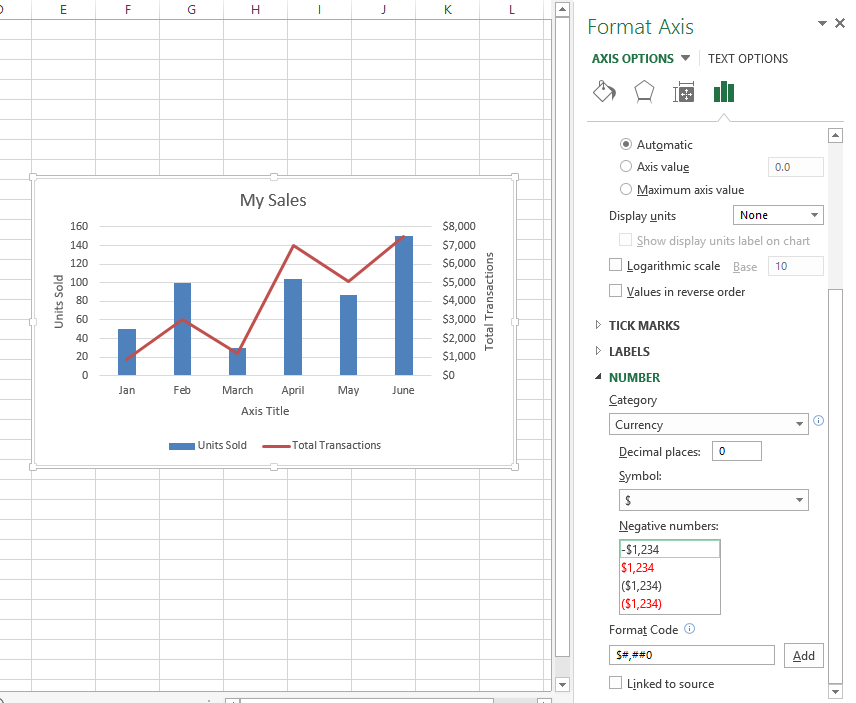
- Spreadsheet Applications (e.g., Microsoft Excel, Google Sheets): These are widely used for their ease of use and accessibility. They offer basic charting functionality, including combination charts, making them suitable for straightforward visualizations. Excel, for example, allows for a range of customizations, from adjusting colors and data labels to adding trendlines and annotations.
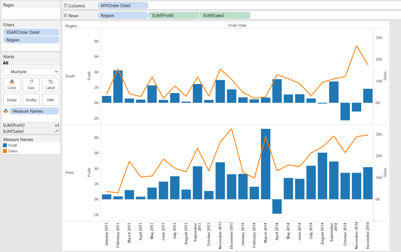
- Dedicated Charting Software (e.g., Tableau, Power BI): These specialized tools excel in data visualization, providing sophisticated features for creating complex combination charts. They often integrate with data sources, offering more robust data analysis capabilities. Tableau, in particular, is known for its interactive dashboards and powerful data blending functionalities, which allow for insightful data exploration.
- Web-Based Tools (e.g., Chart.js, Plotly): These tools offer interactive and customizable charts through web interfaces. They are excellent for creating dynamic charts that can be embedded in websites or presentations. Chart.js, for example, allows for simple yet effective charts that are easily integrated into web applications.
Comparative Overview
A comparative overview of these tools illuminates their strengths and weaknesses. The table below summarizes ease of use, features, and cost for each category. Factors like learning curve, data manipulation capabilities, and customization options are important considerations.
| Tool | Ease of Use | Features | Cost |
|---|---|---|---|
| Microsoft Excel | High | Basic to moderate | Typically included with Microsoft 365 subscription or a one-time purchase |
| Google Sheets | High | Basic to moderate | Free |
| Tableau | Medium | Advanced | Typically subscription-based |
| Power BI | Medium | Advanced | Typically subscription-based |
| Chart.js | Medium-High | Moderate | Free and open-source |
| Plotly | Medium | Advanced | Subscription-based or open-source options available |
Advantages and Disadvantages
Different tools offer varying advantages and disadvantages. Spreadsheet applications are accessible and straightforward for simple charts, while dedicated charting software offers advanced features and integrations for more complex analyses. Web-based tools provide flexibility for dynamic web-based visualizations.
- Spreadsheet Applications (e.g., Microsoft Excel, Google Sheets): Advantages include ease of use and affordability. Disadvantages include limited customization options and potentially less sophisticated data handling for very complex charts.
- Dedicated Charting Software (e.g., Tableau, Power BI): Advantages include powerful data analysis capabilities, advanced customization options, and interactive dashboards. Disadvantages often include higher cost and a steeper learning curve compared to spreadsheet applications.
- Web-Based Tools (e.g., Chart.js, Plotly): Advantages include flexibility for web-based visualizations and often offer open-source options. Disadvantages might include less support for complex data manipulations compared to dedicated software.
Final Summary

In conclusion, creating combination charts is a multifaceted process involving careful consideration of data type, chart selection, and presentation. This guide provides a detailed roadmap, encompassing the creation, customization, and interpretation of these powerful visual tools. By mastering the techniques discussed, you’ll be well-equipped to effectively communicate insights and trends through compelling visualizations. Remember, the key to success lies in understanding your data and choosing the right chart to represent it clearly.