Data visualization is crucial for understanding complex information. Data bars and color scales are powerful tools that transform raw data into easily digestible visuals. This guide provides a comprehensive overview of creating effective data bars and color scales, from fundamental concepts to advanced techniques. Learn how to represent data accurately and engagingly, improving data interpretation and communication.
This guide will cover everything from defining data bars and color scales, and the types of data they are best suited for, to practical implementation within various tools. We’ll explore different styles, colors, and sizes to optimize visual appeal and clarity. You’ll discover best practices, common mistakes, and advanced techniques to create compelling visualizations.
Introduction to Data Bars and Color Scales

Data bars and color scales are powerful tools in data visualization, transforming numerical data into easily digestible visual representations. They effectively communicate trends, comparisons, and patterns within datasets, enabling quick insights and understanding. These visual aids are particularly beneficial for highlighting key data points and providing a holistic view of the information presented.Data bars and color scales leverage visual cues, such as length or color intensity, to represent numerical values.
This direct mapping of data to visual attributes allows for quick comparisons and identification of significant variations. The intuitive nature of these representations fosters a deeper understanding of the data without requiring extensive analysis.
Definition and Purpose
Data bars visually represent numerical values using bars of varying lengths. Color scales, conversely, use varying shades or intensities of color to represent different numerical values. Both methods serve the purpose of emphasizing the magnitude of data points and facilitate quick comparisons across multiple data entries. Their purpose is to enhance data interpretation and highlight important trends or patterns within the dataset.
Types of Data Suitable for Data Bars and Color Scales
Data bars and color scales are well-suited for a wide variety of numerical data. Categorical data, when paired with numerical values, can be effectively displayed using these techniques. For example, sales figures for different product categories, or website traffic statistics for various website sections, benefit significantly from visual representations. Time-series data, showcasing trends over time, is also well-suited, providing a clear visual representation of changes in numerical values.
Contribution to Data Interpretation
Data bars and color scales contribute significantly to data interpretation. By providing a visual representation of the magnitude of numerical data, they allow users to quickly identify the highest and lowest values, significant fluctuations, and overall trends. The use of color and length makes it easier to compare data points, facilitating a better understanding of the relationships between them.
This visualization approach reduces the cognitive load required for comprehending complex numerical data.
Basic Visualization Example
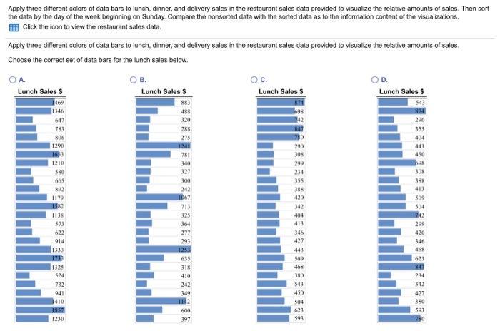
This example demonstrates a basic data bar and color scale visualization. The table displays sales figures for different product categories, with data bars representing sales amounts and a color scale providing a visual representation of sales percentages.
| Product Category | Sales Amount ($) | Sales Percentage (%) | |
|---|---|---|---|
| Electronics |
|
|
75 |
| Clothing |
|
|
50 |
| Books |
|
|
62.5 |
The table illustrates a simple data bar visualization using varying widths. Similarly, a color scale could be implemented to represent the percentage values. The example uses color blocks for percentages. This illustrates how these visual elements can easily communicate data trends and comparisons.
Creating Data Bars
Data bars are a powerful visual tool for highlighting variations in data within a dataset. They effectively represent numerical values by using bars of varying lengths, making it simple to quickly grasp the relative magnitudes of different data points. This visual representation enhances data analysis by providing a clear comparison across categories. Data bars are particularly useful in dashboards and reports, facilitating quick comprehension of key performance indicators (KPIs).Data bars are created by transforming numerical data into visual representations using bars.
This transformation process, often automated within spreadsheet software, allows users to identify trends and patterns in the data. The visual nature of data bars enables quick and intuitive understanding, making them an essential element in data visualization.
Data Preparation
Proper data preparation is crucial for effective data bar creation. Ensure the data is clean, consistent, and accurately reflects the intended comparisons. Missing or erroneous data can skew results and mislead interpretations. Data should be organized in a structured format, typically in a table or spreadsheet, with clear categories and corresponding numerical values. It’s important to verify the accuracy of the data before creating data bars, as any errors will be reflected in the visualization.
Data Bar Types
Data bars offer various representation methods. Understanding these types allows for choosing the most appropriate visualization for the data and the intended analysis.
- Stacked Data Bars: Stacked data bars are useful for comparing parts of a whole. They represent multiple data series within the same category. Each bar is divided into segments, each corresponding to a data series, and the total length of the bar represents the sum of all data series in that category. Stacked bars are ideal for illustrating the contribution of individual elements to a total value.
- Grouped Data Bars: Grouped data bars display multiple data series for different categories. Each category is represented by a group of bars, where each bar within a group corresponds to a specific data series. This format enables side-by-side comparison of data series across categories, revealing differences and similarities between groups.
Data Bar Styles and Visual Impact
The style of data bars significantly affects their visual impact. Choosing the right style ensures clarity and enhances the visual appeal of the presentation.
- Solid Color Data Bars: These provide a straightforward visual representation of the data, suitable for simple comparisons. The visual impact relies on the color’s contrast with the background.
- Gradient Data Bars: Gradient data bars use a smooth transition of colors to represent the data, adding visual appeal. The gradient can be from light to dark, or from one color to another, enhancing the visual impact. The direction and intensity of the gradient affect the visual appeal.
- Patterned Data Bars: Patterned data bars use repeating patterns to visually distinguish data series. The pattern and color combination affect the overall aesthetic of the visualization.
Adjusting Data Bar Colors and Sizes
Adjusting data bar colors and sizes can enhance clarity and visual appeal. Color choices should consider accessibility and readability. Using contrasting colors improves visibility and readability, especially for those with visual impairments. Data bar sizes should be proportionate to the values they represent, ensuring accurate representation. Bar size adjustments can also be used to highlight critical data points.
Data Bar Types and Applications
| Data Bar Type | Application |
|---|---|
| Stacked | Comparing parts of a whole, analyzing component contributions. |
| Grouped | Comparing multiple data series across different categories. |
| Solid Color | Simple comparisons, straightforward visualizations. |
| Gradient | Adding visual appeal, highlighting data trends. |
| Patterned | Distinguishing data series, enhancing visual appeal. |
Data Bar Formatting Options
| Formatting Option | Description |
|---|---|
| Colors | Choosing colors that are visually distinct and easily readable. Contrast is essential for accessibility. |
| Widths | Adjusting bar widths to maintain proportionality with the data values. |
| Labels | Adding labels to data bars to clarify the data series and values. |
Designing Color Scales
Choosing appropriate color scales is crucial for effective data visualization. Well-designed color scales enhance the clarity and interpretation of data, enabling viewers to quickly grasp trends and patterns. Conversely, poorly chosen color scales can obscure insights and lead to misinterpretations. This section delves into the different types of color scales, their appropriate use cases, and best practices for selecting and using them.
Types of Color Scales
Color scales are categorized into three primary types: sequential, diverging, and qualitative. Each type serves a distinct purpose in conveying different kinds of data. Understanding these differences is essential for selecting the most appropriate scale for a given dataset.
Sequential Color Scales
Sequential color scales employ a smooth progression of colors, typically from a light to a dark shade. This type of scale is best used for representing data that exhibits a continuous range, where values gradually increase or decrease. For example, visualizing temperature data over time, showing the distribution of income levels, or depicting population density across a region all benefit from sequential color scales.
The progression of color clearly indicates the magnitude of the data, making it easy to identify trends and patterns. Examples include a scale progressing from light blue to dark blue to show increasing water depth or a scale from light yellow to dark red to represent increasing temperatures.
Diverging Color Scales
Diverging color scales use colors that spread outward from a neutral or midpoint. This midpoint is often a zero or reference point. This design is suitable for data that has a central value and values that diverge away from it. For instance, a diverging scale might be used to visualize the deviation of stock prices from an average or to illustrate the difference in temperature from a normal value.
The colors on either side of the midpoint convey the direction and magnitude of the deviation from the central point. For example, a diverging scale might use green for values below the average and red for values above the average.
Qualitative Color Scales
Qualitative color scales use distinct colors for different categories or groups of data. These scales are essential for representing categorical data where each value belongs to a specific group or class. For example, in a survey, a qualitative color scale can visually represent the different choices made by participants or to visually categorize various products or brands. This type of scale is useful for highlighting differences between distinct categories without implying any ordering or magnitude relationship between them.
Each category is visually distinct, enhancing clarity and comprehension. For example, in a map showing different types of land use (residential, commercial, agricultural), different colors could be used for each category.
Choosing Effective Color Scales
Choosing the right color scale involves careful consideration of the data being represented. The scale should not only visually represent the data but also enhance its interpretation. Consider these factors:
- Data Range and Distribution: Sequential scales are best for data with a continuous range, while diverging scales are better for data centered around a specific value, and qualitative scales are suited for categorical data.
- Data Interpretation: The selected colors should intuitively represent the data’s magnitude or category. The colors should not create any visual bias or confuse the viewer.
- Color Accessibility and Contrast: Ensure that the color scale is accessible to people with color vision deficiencies. Sufficient contrast between colors is essential for readability.
Color Accessibility and Contrast
Color accessibility is paramount for inclusive data visualization. Colorblindness affects a significant portion of the population, making it crucial to design color scales that are distinguishable for everyone. The color contrast between different elements of the scale should be high enough to ensure readability for individuals with various visual impairments. This includes using color palettes that have sufficient luminance differences to avoid confusion.
Comparing Color Scale Types
| Color Scale Type | Strengths | Weaknesses |
|---|---|---|
| Sequential | Excellent for showing magnitude and trends in continuous data; easy to understand | Can be less effective for highlighting specific values; may not be suitable for categorical data |
| Diverging | Effective for highlighting differences from a central point; clear representation of magnitude and direction | Can be complex if the data range is extensive; might be less effective for simple trends |
| Qualitative | Ideal for categorical data; ensures visual distinction between categories | Does not convey magnitude or ordering; might become confusing with numerous categories |
Implementing Data Bars and Color Scales in Data Visualization Tools

Implementing data bars and color scales in data visualization tools enhances the clarity and visual appeal of data presentations. These tools provide intuitive interfaces for customizing these elements, allowing users to effectively communicate insights from their data. This section details the implementation process in popular tools, focusing on customization and interactive features.Data visualization tools like Excel, Tableau, and Google Sheets offer diverse options for incorporating data bars and color scales.
These tools enable users to transform raw data into compelling visual representations, facilitating a deeper understanding of trends, patterns, and outliers within the data. Proper implementation of these visual aids is critical for effective data communication.
Implementing Data Bars in Excel
To create data bars in Excel, select the data range you want to visualize. Then, go to the “Home” tab and click on the “Data Bars” option in the “Styles” group. Excel will automatically apply data bars based on the values in the selected range. You can customize the data bar colors and patterns through the “Format Data Bars” options.
Adjusting the bar colors and patterns further enhances visual differentiation and clarity within the data.
Customizing Data Bars and Color Scales in Tableau
Tableau provides a more sophisticated approach to data bar and color scale implementation. It allows for greater control over the appearance and interaction of these elements. To create data bars in Tableau, drag the desired data field to the “Marks” card and select “Data Bars” from the available options. Further customization is achieved through the “Marks” card and the ability to adjust colors, patterns, and the data representation style.
Creating Interactive Data Bars and Color Scales in Google Sheets
Google Sheets offers a simpler, user-friendly approach to data bars and color scales. Select the data range and navigate to the “Format” menu. Choose “Data Bars” or “Color Scales” to implement these visual elements. The resulting visualization is immediately visible. Customization options include adjusting bar colors, scale ranges, and other presentation characteristics.
Adjusting Formatting and Appearance in Data Visualization Tools
Formatting and appearance adjustments are essential for creating effective data visualizations. Excel allows for modifications in bar colors, patterns, and the placement of data bars. Tableau offers a wide array of customization options for colors, patterns, and the overall style of the data bar. Google Sheets provides a range of choices for modifying bar colors, patterns, and scale ranges.
Best Practices for Choosing Data Visualization Tools
Selecting the appropriate data visualization tool depends on the complexity of the data set and the desired level of customization. Excel is suitable for simple visualizations and quick analysis. Tableau excels in complex data sets and interactive dashboards. Google Sheets is a practical choice for straightforward visualizations and collaborative work. Consider factors such as data size, analysis requirements, and the desired level of interaction when choosing a tool.
Table: Implementing Data Bars in Various Tools
| Tool | Steps to Implement Data Bars |
|---|---|
| Excel | Select data range, go to “Home” tab, click “Data Bars” |
| Tableau | Drag data field to “Marks” card, select “Data Bars” |
| Google Sheets | Select data range, navigate to “Format” menu, choose “Data Bars” |
Best Practices and Considerations
Effective data visualization relies not only on the technical implementation of data bars and color scales but also on thoughtful consideration of best practices. These practices encompass selecting appropriate visualizations, ensuring accessibility, maintaining clarity, and avoiding pitfalls that can obscure rather than illuminate the data. A nuanced understanding of these aspects leads to more informative and impactful data presentations.
Selecting Appropriate Data Bar and Color Scale Types
Choosing the right visualization type is crucial for clear data communication. Consider the nature of your data and the message you wish to convey. Quantitative data, for instance, often benefits from data bars, allowing for easy comparison of values. Categorical data, however, might be better represented with color scales, enabling viewers to quickly distinguish different categories. For instance, representing sales figures for different products over time would be better suited with data bars, showing clear trends.
On the other hand, showing the distribution of customer demographics across different regions would benefit from a color scale. Data bars are more suitable for showing relative magnitudes, while color scales highlight distinctions between categories. Therefore, matching the visualization to the data type ensures the most informative and easily interpretable presentation.
Accessibility and Inclusivity in Data Visualization
Accessibility and inclusivity are paramount in data visualization. Data visualizations should be easily understandable for all audiences, regardless of their background or abilities. This includes using sufficient color contrast, providing clear labels, and considering potential visual impairments. Adequate color contrast ensures that color-blind individuals can perceive distinctions. Clear labels ensure that the data is readily understood.
Alternative text for images is crucial for users with screen readers, providing context and meaning. Furthermore, avoiding overly complex or crowded visualizations is essential for all users.
Ensuring Clear and Concise Data Representation
Clear and concise data representation is essential for effective communication. Avoid ambiguous or overly complex visualizations. Data bars and color scales should be clearly labeled, with appropriate units and scales. Avoid using misleading colors or patterns. For example, using a diverging color scale to highlight differences in a dataset, where the extremes are clearly defined and the middle values are more ambiguous, can lead to misinterpretations.
Employ clear labels and concise titles, enabling viewers to grasp the message quickly. Data labels are also essential for providing the specific values behind the visualization, which can increase its clarity and detail.
Effective and Ineffective Data Bar and Color Scale Implementations
Effective implementations utilize appropriate scales and labels, highlighting significant differences in the data. They are clear and easy to understand, ensuring that the message is conveyed accurately. Ineffective implementations often utilize confusing or inappropriate color scales, making it difficult to distinguish between categories or values. Scales may not be clearly labeled or have inaccurate increments, leading to misinterpretations.
Moreover, the data may be presented in a cluttered manner, hindering comprehension.
Avoiding Visual Clutter and Maintaining Data Clarity
Visual clutter can obscure data and impede understanding. Avoid using excessive colors, patterns, or labels. Prioritize clear, concise labeling. Choose a color scheme that emphasizes data distinctions rather than visual aesthetics. Effective visualizations are designed to highlight patterns and trends in the data, not to overwhelm the viewer with distracting visual elements.
Simple and clean designs ensure that the data takes center stage. Avoid using colors that are too similar, or that might confuse or mislead viewers.
Common Mistakes and Solutions in Using Data Bars and Color Scales
| Mistake | Solution |
|---|---|
| Using an inappropriate color scale for the data type | Choose a color scale appropriate to the data being represented. Consider the type of data (quantitative or categorical) and the message you want to convey. |
| Insufficient color contrast | Ensure sufficient color contrast between the bars or colors, especially for colorblind viewers. Use tools to check for color contrast compliance. |
| Missing or unclear labels and scales | Include clear labels for data bars and color scales, along with appropriate units and scales. |
| Overuse of visual elements (e.g., patterns, colors) | Prioritize clear and concise data representation. Avoid excessive use of patterns, colors, or visual elements that might obscure the data. |
| Using misleading color schemes | Select a color scheme that clearly distinguishes between categories or values. Avoid using colors that might be misinterpreted or that create false impressions. |
Advanced Techniques
Data bars and color scales, while fundamental for visualizing data, can be significantly enhanced through advanced techniques. These methods allow for a deeper exploration of data patterns and a more engaging user experience. Sophisticated customization options, combined with interactive elements, empower users to dissect complex datasets and extract actionable insights.Advanced techniques in data visualization extend beyond basic implementations, focusing on delivering detailed and dynamic representations of information.
These techniques enhance data understanding by providing a more intuitive and interactive experience. This often involves integrating additional features like data labels, annotations, and interactivity to improve the visualization’s effectiveness.
Customizing Data Bars and Color Scales
Data bars and color scales can be further customized to cater to specific needs and data characteristics. Color ramps, bar shapes, and labeling options can be tailored for optimal clarity and aesthetic appeal. This includes the ability to modify the color palettes (e.g., diverging color scales for positive and negative values), adjust bar thickness and spacing, and select from a range of visual representations (e.g., graduated bars, segmented bars).
Customizing these aspects improves data interpretation and presents information in a visually appealing and informative manner.
Incorporating Data Labels and Annotations
Data labels and annotations are crucial for enhancing data bar and color scale visualizations. They provide context and value by directly displaying the associated data points, trends, and insights. This allows users to quickly understand the underlying numerical values associated with each data point within the visualization. Annotations can be used to highlight specific data points, draw attention to trends, and offer supplementary information.
For instance, adding a tooltip that displays the exact value when hovering over a data bar or a callout highlighting a particular segment within a color scale.
Using Data Bars and Color Scales for Complex Datasets
Complex datasets often require specialized visualization techniques. Using data bars and color scales for large datasets or multiple variables can be challenging. Techniques such as hierarchical structuring, filtering options, and interactive zooming can make such visualizations effective. Interactive filtering and sorting allows users to focus on specific aspects of the data, providing a deeper understanding of the data distribution.
Using different scales and highlighting specific areas within the visualization can aid in identifying patterns and trends. Employing multiple color scales, each representing a different variable, within the same chart allows for a multi-dimensional understanding of the dataset.
Advanced Implementations in Different Contexts
Advanced data bars and color scales find application in various contexts. For instance, in financial analysis, they can highlight stock performance over time. In environmental science, they can illustrate the distribution of pollutants. In marketing, they can display customer segment characteristics. The choice of the appropriate visualization type will depend on the nature of the data being presented.
For example, a stacked data bar chart can effectively visualize sales performance by product category.
Interactive Elements for Enhanced User Engagement
Incorporating interactive elements significantly enhances user engagement. Interactive features, such as tooltips, zooming, and filtering, transform static visualizations into dynamic exploration tools. Tooltips can provide detailed information about specific data points. Zooming allows users to focus on specific regions of the visualization, enabling a deeper analysis of trends and patterns. Filtering lets users isolate particular data subsets for focused examination.
Interactive visualizations create a more dynamic and intuitive experience, enabling users to explore and understand the data more effectively.
Implementation of Interactive Elements
| Interactive Element | Description | Example |
|---|---|---|
| Tooltips | Displays additional information when hovering over a data point. | Hovering over a data bar reveals the corresponding sales figure. |
| Zooming | Allows users to magnify specific regions of the visualization. | Zooming into a section of a color scale reveals detailed information about a specific time period. |
| Filtering | Enables users to isolate data based on specific criteria. | Filtering by product category in a stacked bar chart to examine sales for particular product lines. |
Final Conclusion

In conclusion, this guide has equipped you with the knowledge and tools to create impactful data bars and color scales. By understanding the various types, their appropriate applications, and best practices, you can effectively communicate insights from your data. Remember, clear and accessible visualizations are key to conveying information effectively. Whether you’re working with simple or complex data sets, this comprehensive guide will empower you to create visualizations that tell compelling stories.