Unlock the power of interactive data exploration with slicers and PivotTables. This guide provides a comprehensive approach to using slicers for filtering PivotTable data, empowering you to analyze information in a dynamic and insightful way. Mastering this technique will transform the way you work with data, enabling you to uncover hidden trends and patterns with ease.
From fundamental concepts to advanced techniques, this guide covers everything you need to know. We’ll start with a basic introduction, progress through practical examples, and culminate with a discussion of best practices, case studies, and troubleshooting. Learn how to create interactive dashboards that allow for rapid data analysis and decision-making.
Introduction to Slicers and PivotTables

PivotTables and slicers are powerful tools in Microsoft Excel (and similar spreadsheet applications) for analyzing large datasets. PivotTables allow users to summarize and organize data in various ways, while slicers provide an intuitive and interactive method to filter the data displayed within the PivotTable. This combination enables users to explore data effectively, identifying trends and patterns more easily than with raw data.Slicers, in essence, are interactive controls that enable users to filter the data displayed in a PivotTable.
They offer a visual and user-friendly interface for selecting specific criteria, thereby dynamically updating the PivotTable’s content. This facilitates exploration and analysis by allowing users to drill down into specific subsets of their data.
Core Functionalities of Slicers
Slicers provide a visual interface for filtering PivotTable data. Users can select criteria from different fields, such as product category, region, or date. The selections made in the slicers immediately update the PivotTable, displaying only the data matching the chosen criteria. This dynamic interaction allows users to quickly analyze different aspects of their data.
Benefits of Using Slicers for Interactive Data Exploration
Slicers enhance data exploration by enabling users to analyze subsets of data quickly. This is crucial for identifying trends and patterns, making informed decisions, and gaining insights that would be challenging to uncover from raw data. The visual nature of slicers simplifies the filtering process, allowing users to quickly isolate and examine specific data points. The interactive nature enables real-time exploration of the data, providing a dynamic view of the relationships between different variables.
Example of a PivotTable with Slicers
This table demonstrates a basic PivotTable with sample sales data, highlighting the role of slicers in filtering the results.
| Region | Product | Sales |
|---|---|---|
| North | Laptop | 1200 |
| North | Tablet | 800 |
| South | Laptop | 1500 |
| South | Tablet | 900 |
| West | Laptop | 1800 |
| West | Tablet | 1100 |
This PivotTable shows sales figures by region and product. Slicers for “Region” and “Product” would allow users to quickly focus on sales for specific regions (e.g., only the South region) or products (e.g., only laptops). With slicers, users can instantly explore the data to identify patterns, such as higher sales in the West region for laptops.
Creating Slicers for PivotTables
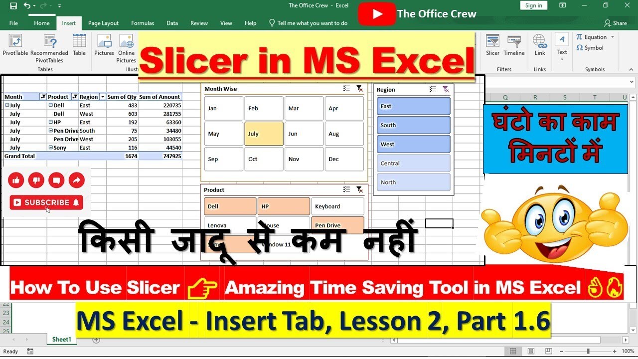
Adding slicers to your PivotTables transforms them from static reports into dynamic, interactive tools. Users can filter the displayed data quickly and intuitively, exploring different perspectives and gaining deeper insights. This section details the steps to create and customize slicers for effective analysis.
Adding Slicers to an Existing PivotTable
To add a slicer to an existing PivotTable, Excel provides a straightforward process. Select the PivotTable you want to enhance. Then, in the “PivotTable Tools” tab, locate the “Analyze” group. Within this group, click on the “Insert Slicer” button. A dialog box will appear allowing you to choose the fields you want to use for slicing.
This process is a simple, efficient way to add interactivity to your reports.
Data Types for Slicers
Slicers can be created from various data types present in your PivotTable source data. Numerical data, including integers and decimals, can be effectively sliced to focus on specific ranges. Date fields allow filtering by specific time periods, enabling analysis of trends and patterns over time. Categorical data, like product names or customer segments, allows you to isolate particular groups for more focused investigation.
These different data types allow for a wide range of filtering options and detailed analysis.
Customizing Slicer Appearance and Behavior
Excel offers options to customize the appearance and behavior of your slicers. This includes changing the slicer’s style, color, and font. You can also adjust the size and position of the slicer controls on the worksheet. For a more tailored experience, you can configure the slicer to display only specific values, enabling the user to focus on particular data subsets.
Further options include controlling the order of the items in the slicer and whether to show items that are not present in the current filter.
Configuring Slicer Interactions
Effective slicer interactions are critical for dynamic analysis. The default behavior often allows filtering based on multiple selections. However, you can configure the interactions for each data field in your PivotTable. For example, you might want one slicer to filter a specific field while another slicer interacts with a different field in a cascading manner. This allows you to create sophisticated analysis workflows, enabling exploration of relationships between different data dimensions.
Steps to Create a Slicer
| Step | Action | Description |
|---|---|---|
| 1 | Select the PivotTable | Choose the PivotTable you want to enhance. |
| 2 | Go to “Analyze” tab | Locate the “Analyze” group within the “PivotTable Tools” tab. |
| 3 | Click “Insert Slicer” | Select the “Insert Slicer” button to open the slicer selection dialog. |
| 4 | Choose fields for slicer | Select the fields you want to use for filtering in the dialog. |
| 5 | Customize appearance (optional) | Modify the slicer’s style, size, and position if desired. |
Using Slicers for Interactive Filtering
Slicers provide a user-friendly interface for dynamically filtering data within a PivotTable. This interactive filtering capability enhances data exploration and analysis by allowing users to quickly isolate specific subsets of information. By selecting different slicer items, users can instantly see the impact on the summarized data displayed in the PivotTable.Effectively using slicers empowers users to explore trends, patterns, and outliers within their data.
This approach fosters a more insightful understanding of the underlying data relationships. The ability to filter and refine the view is essential for making informed decisions and drawing accurate conclusions from the data.
Filtering Data in a PivotTable with Slicers
Slicers act as interactive filters for your PivotTable, enabling precise data selection. Selecting a slicer item directly impacts the PivotTable, dynamically updating the displayed data. This ensures that the PivotTable always reflects the current selection criteria. This iterative process allows users to drill down into specific data segments, leading to more targeted analyses.
Selecting Multiple Slicer Items Simultaneously
Simultaneous selection of multiple slicer items is achieved by holding down the Ctrl key while clicking on the desired items. This method enables users to focus on multiple criteria simultaneously. For example, a user can select “Region A” and “Region B” to view combined sales data from both regions. This technique allows for a more granular examination of specific combinations of factors.
Effect of Filtering on PivotTable Data
Filtering data with slicers directly affects the summarized data displayed in the PivotTable. The PivotTable dynamically updates to reflect the selected criteria, displaying only the relevant data points. This feature enables the visualization of the data subset matching the slicer selections, ensuring the user views the data relevant to their current analysis focus.
Dynamic PivotTable Updates Based on Slicer Selections
The PivotTable automatically updates in real-time as users interact with the slicers. This dynamic update ensures the displayed data is always consistent with the current slicer selections. This continuous adaptation ensures users are always looking at the most pertinent data for their current perspective.
Example of Multiple Filters in a PivotTable
This table illustrates how multiple slicer selections affect the PivotTable.
| Slicer – Region | Slicer – Product | PivotTable – Sales |
|---|---|---|
| North | Widget A | $10,000 |
| North | Widget B | $5,000 |
| South | Widget A | $8,000 |
| South | Widget B | $12,000 |
| North | (All Products) | $15,000 |
| South | (All Products) | $20,000 |
| (All Regions) | Widget A | $18,000 |
| (All Regions) | Widget B | $17,000 |
This table shows a sample PivotTable displaying sales figures. The PivotTable is dynamically filtered by the selections in the slicer. For example, if “North” and “Widget A” are selected in their respective slicers, the PivotTable will display only the sales data for the “North” region and “Widget A” product.
Advanced Slicer Functionality
Slicers, beyond their basic filtering capabilities, offer powerful advanced features to enhance interactive analysis within PivotTables. These features allow for more complex data exploration, enabling users to drill down into specific data segments and gain deeper insights. Mastering these advanced techniques unlocks the true potential of slicers for data-driven decision-making.
Cascading Slicers
Cascading slicers enable a hierarchical filtering approach, where selections in one slicer influence the available options in subsequent slicers. This feature is particularly useful when dealing with multiple dimensions of data, allowing users to progressively narrow down their analysis. For instance, a slicer for “Region” could be followed by a slicer for “Product” that dynamically updates based on the selected region.
This ensures users only see relevant product data for the chosen region.
Calculated Fields in PivotTables
Calculated fields in PivotTables provide a means to derive new data from existing data. Slicers can interact with these calculated fields, dynamically altering the calculated values based on the selected filters. For example, a calculated field could determine the percentage of sales for a particular product category within a region. The slicer selection for the region would then immediately update this percentage value.
This allows users to explore trends and patterns in the data in real-time.
Showing/Hiding PivotTable Data
Slicers can be utilized to dynamically show or hide specific PivotTable data. This capability allows for customized views of the data based on slicer selections. If a user selects a specific product line in a slicer, the PivotTable will only display data related to that product line, effectively hiding all other data. This streamlined presentation focuses the user’s attention on the desired information.
Drill-Down Analysis
Slicers can facilitate drill-down analysis, allowing users to move from a high-level summary in a PivotTable to more detailed data. For instance, a slicer selection for a particular product category could expand the PivotTable to display sales figures at the individual product level. This capability allows users to investigate details and identify underlying patterns within the selected segment.
Slicer Interaction with Calculated Fields
The following table demonstrates how slicer selections affect calculated fields within a PivotTable. The example utilizes sales data for different product categories across various regions.
| Region | Product Category | Total Sales | Percentage of Region Sales |
|---|---|---|---|
| North | Electronics | $50,000 | 40% |
| North | Clothing | $30,000 | 24% |
| South | Electronics | $60,000 | 48% |
| South | Clothing | $40,000 | 32% |
| Total | $180,000 |
In this example, the “Region” slicer would affect the “Percentage of Region Sales” calculated field. Selecting “North” in the slicer would update the “Percentage of Region Sales” column, showing the proportion of sales for each product category within the North region. The total percentage column will also be updated to show the percentage of sales from the entire region.
Best Practices and Tips
Effective slicer implementation significantly enhances user interaction with PivotTables. By adhering to best practices, users can efficiently explore data and derive valuable insights. This section details optimal slicer placement, common pitfalls to avoid, strategies for user-friendly interactions, effective labeling techniques, and illustrative examples.Understanding the principles behind optimal slicer design will allow you to create powerful, user-friendly data exploration tools.
These principles will streamline the user experience, allowing them to effectively extract meaningful information from complex datasets.
Optimal Slicer Placement
Proper slicer placement is crucial for intuitive data exploration. Slicers should be positioned to minimize visual clutter and maximize user accessibility. Consider the following guidelines:
- Place slicers near the PivotTable they filter. This proximity creates a clear visual link between the slicer and its target. The user’s eye will naturally move from the slicer to the filtered table.
- Avoid placing slicers in areas that obstruct other important elements of the dashboard, such as charts or key metrics.
- Ensure that the slicer does not obscure essential data in the PivotTable. Consider the visual space required for both the slicer and the PivotTable.
Common Pitfalls
Several pitfalls can negatively impact the user experience when working with slicers. Awareness of these pitfalls is essential for creating effective and reliable tools.
- Overuse of slicers: Multiple slicers on a single PivotTable can lead to complex and confusing filtering. Prioritize the use of slicers for filtering the most important dimensions.
- Poorly designed slicer interactions: If slicer interactions are not carefully planned, the user might struggle to navigate through different filtering combinations. Use clear and intuitive interactions.
- Inconsistent labeling: Inconsistent naming conventions for slicer items can make the filtering process confusing. Maintain a consistent naming pattern across slicers to enhance readability and reduce ambiguity.
User-Friendly Slicer Interactions
User-friendly slicer interactions are paramount for enabling seamless exploration of data.
- Enable single and multiple selection: Allow users to select multiple items within a slicer to filter the PivotTable by multiple criteria simultaneously. This capability offers more granular control.
- Implement clear feedback mechanisms: Provide visual feedback to the user to indicate which filters are active. For instance, highlighting selected items or showing the number of filtered results.
- Support clear filtering options: Offer clear filtering options to help users understand how their selections are impacting the PivotTable results. This can include providing a count of the filtered rows.
Effective Slicer Labels
Effective slicer labels are essential for clear and unambiguous filtering. Well-defined labels enhance user understanding and reduce confusion.
- Use concise and descriptive labels: Choose labels that clearly and accurately reflect the slicer’s purpose. Avoid ambiguous or overly technical terms.
- Employ consistent capitalization: Maintain consistent capitalization conventions for labels to enhance readability and consistency across the dashboard.
- Use a consistent style: Adopt a consistent style guide for slicer labels to improve the overall appearance and readability of the dashboard.
Examples of Best Practices in Slicer Design
The following examples illustrate best practices in slicer design. Each example highlights a different aspect of effective slicer implementation.
| Example | Description |
|---|---|
| Example 1: Intuitive Placement | A slicer for “Region” is placed directly above a PivotTable displaying sales data by region. This proximity makes the filtering action intuitive and clear. |
| Example 2: Effective Labeling | A slicer labeled “Product Category” uses clear and concise labels, such as “Electronics,” “Clothing,” and “Home Goods,” making it easy for users to understand and select the desired category. |
| Example 3: User-Friendly Interactions | A slicer for “Date” allows users to select a range of dates. This is a practical feature for time-series analysis, providing flexibility and efficiency. |
Case Studies and Examples

Slicers, when integrated with PivotTables, offer powerful tools for interactive data exploration. This section presents real-world case studies and practical examples to demonstrate the versatility and effectiveness of slicers in diverse business scenarios. Understanding how slicers can be applied in different industries and with varying data types is crucial for maximizing their potential within your organization.
A Retail Sales Case Study
Retail businesses often face challenges in analyzing sales trends across various product categories and regions. A hypothetical retailer used slicers to tackle this problem. Their PivotTable contained sales data, categorized by product type, region, and sales period (month). Slicers were created for each of these categories, allowing users to interactively filter the data. By selecting specific product types (e.g., clothing, electronics), regions (e.g., North, South), and time periods (e.g., Q1 2023), the retailer could quickly identify top-selling products, regional performance, and seasonal sales trends.
This enabled targeted marketing campaigns, inventory adjustments, and strategic pricing decisions.
Visualizing Sales Data with Slicers
Sales data visualization is a key aspect of business intelligence. Slicers, when paired with PivotTables, offer an intuitive way to display and analyze sales data. For instance, a company could use slicers to filter sales figures by product line, customer segment, and sales representative. The resulting PivotTable would display sales performance in a concise and easily understandable format, highlighting key metrics and areas for improvement.
Sales Trends Over Time
| Month | Product Category | Sales Amount |
|---|---|---|
| January 2024 | Electronics | $15,000 |
| January 2024 | Clothing | $12,000 |
| February 2024 | Electronics | $18,000 |
| February 2024 | Clothing | $14,000 |
| March 2024 | Electronics | $20,000 |
| March 2024 | Clothing | $16,000 |
This table illustrates a simple example of sales trends over time. Slicers allow users to select specific months and product categories to drill down into the detailed data, identifying trends and patterns in sales performance.
Slicer Applications Across Industries
Slicers are not limited to a single industry. Their adaptability allows for use in various sectors. For instance, in healthcare, slicers can be used to filter patient data by diagnosis, treatment, and location, providing insights into treatment effectiveness and resource allocation. In finance, slicers can filter investment portfolio data by asset class, risk profile, and time period to analyze investment performance and identify potential risks.
In education, slicers can filter student data by grade level, subject, and performance metrics to track student progress and identify areas needing support. The flexibility of slicers allows for a wide range of applications tailored to specific business needs.
Illustrative Examples with Different Data Types
| Industry | Data Type | Slicer Application |
|---|---|---|
| Retail | Sales | Filtering sales by product, region, and time period to identify trends and optimize strategies. |
| Finance | Investment Portfolio | Analyzing investment performance by asset class, risk profile, and time period to assess and manage risk. |
| Healthcare | Patient Data | Filtering patient data by diagnosis, treatment, and location to understand treatment effectiveness and resource allocation. |
This table presents a concise overview of diverse applications of slicers across industries. By filtering data in PivotTables, slicers enable data analysis, identification of trends, and actionable insights.
Troubleshooting and Error Handling

Troubleshooting slicer issues in PivotTables can stem from various factors, ranging from incorrect data formatting to compatibility problems with other Excel features. Understanding these potential problems and their solutions is crucial for maintaining the interactive functionality of your PivotTables and slicers. Proper diagnosis and resolution strategies will help ensure your data analysis remains efficient and reliable.
Common Slicer-Related Errors
Incorrect data types in the source data can lead to slicer issues. For instance, if a field intended for slicer selection (e.g., “Date”) is formatted as text instead of a date, the slicer might not function as expected, preventing proper filtering. Similarly, inconsistencies in data values, such as typos or missing values, can cause unexpected behavior or errors in the slicer interaction.
Fields with a large number of unique values might slow down the slicer’s performance. Furthermore, problems with the underlying PivotTable structure, such as a damaged or corrupted model, can also impact the slicer.
Resolving Slicer Errors
Addressing slicer errors requires a methodical approach. First, examine the source data to ensure the correct data types are used for slicer fields. Validate data integrity by checking for typos, missing values, or any inconsistencies that might be disrupting slicer functionality. Consider reducing the number of unique values in the slicer field if performance issues arise. If the PivotTable structure is suspect, rebuild the PivotTable, ensuring that all necessary data is present and properly formatted.
Finally, check for compatibility issues between the slicer and other Excel features.
Diagnosing Slicer Issues
Troubleshooting slicer issues involves a systematic approach. Begin by observing the specific error message, if any, displayed in Excel. Examine the data source to check for potential issues in the formatting, type, or structure of the data. Pay close attention to any unusual behavior, such as slow performance or the inability to interact with the slicer. Observe how the slicer reacts to different filters.
Is there a specific value or range that triggers the problem? This focused investigation can lead to identifying the source of the issue.
Error Scenarios and Solutions
| Error Scenario | Possible Cause | Solution |
|---|---|---|
| Slicer does not filter PivotTable | Incorrect data type, invalid data, or PivotTable issue | Verify data type of slicer field in source data. Ensure data integrity (no typos, missing values). Rebuild the PivotTable if necessary. |
| Slicer is unresponsive or slow | Large number of unique values in the slicer field, or insufficient system resources. | Consider using a different slicer field with fewer unique values, or filtering the source data to reduce the slicer’s load. |
| Slicer field displays unexpected values | Formatting issues in the source data, or compatibility with other Excel features | Ensure correct formatting in the source data. Check for compatibility issues with other Excel features or add-ins. |
| Slicer displays an error message | Corrupted PivotTable, or formula errors. | Rebuild the PivotTable. Check for errors in formulas or external data connections. |
Final Thoughts
In conclusion, this comprehensive guide provides a complete roadmap for harnessing the power of slicers to enhance your PivotTable analysis. We’ve covered everything from initial setup to advanced functionalities, equipping you with the tools and knowledge to effectively utilize slicers for dynamic data filtering. With practical examples, best practices, and troubleshooting tips, you’re now well-prepared to confidently leverage this powerful tool in your data analysis endeavors.